Our lists get very long, and it would be nice to have the tools stay at the top, as well as the list name so we see what list we’re in (especially with multiple lists open in multiple browser tabs).
Basically the grey title header and other information at the top of the page would stay there. This can maybe be an option.
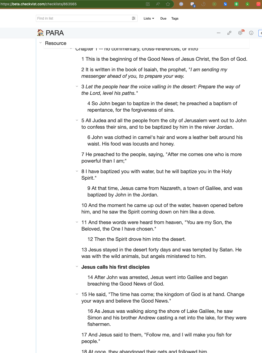
we’re trying another thing on beta - showing sticky parents. Right now only the top-level items are sticky when scrolling. But we’d like to show the full context for the currently visible level. Would you find it useful?
I was thinking to make it a global per-user setting, “Use sticky parent items” or something like this, probably enabled by default.
But could you tell more about the hijacking case - the idea was to show the context of the current item, so it indeed relates to the section you’re working on.
Could you probably share a screenshot of the problematic view? Maybe via email.
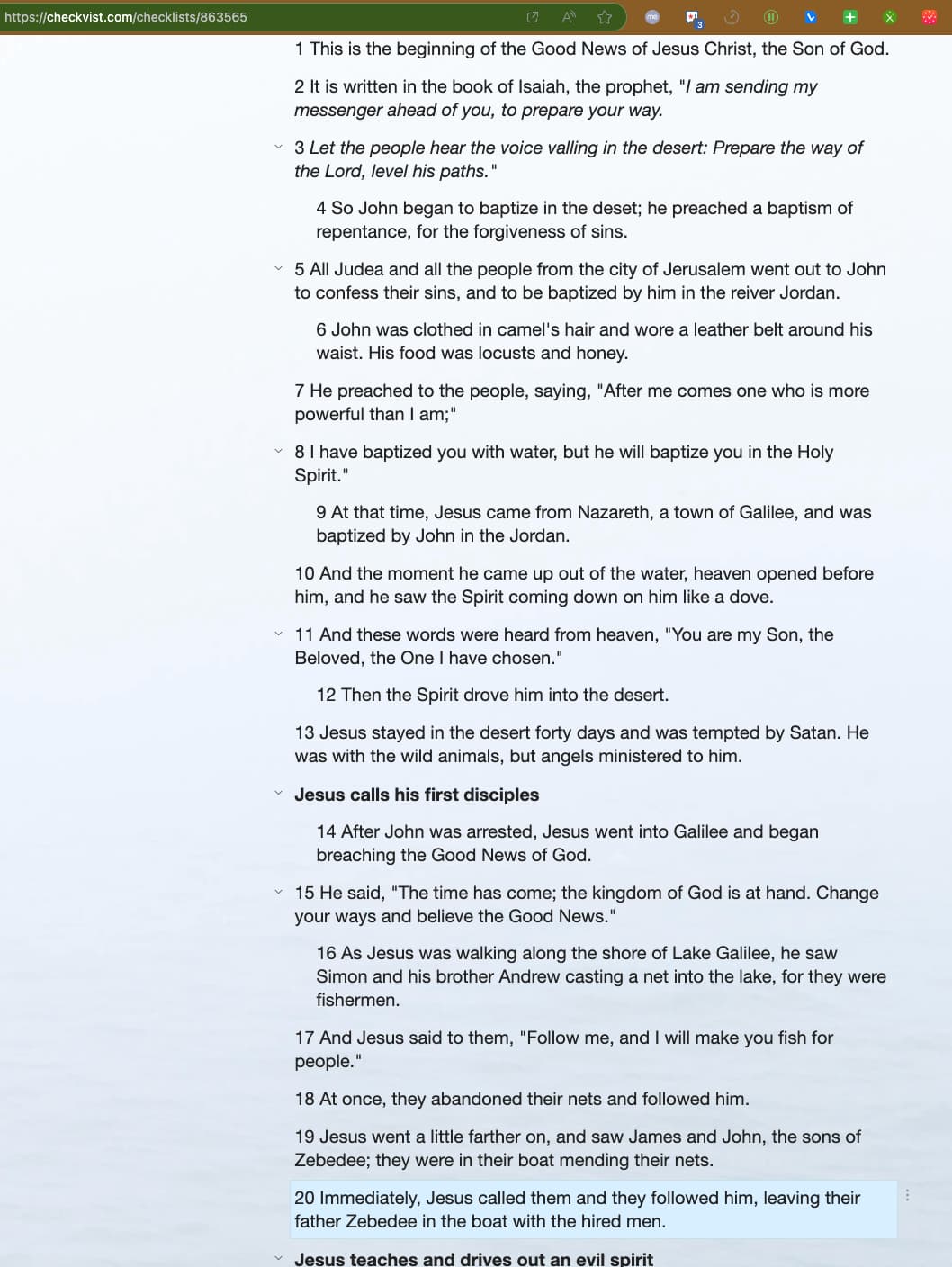
Here are 2 screenshots that show how much less content I can fit in my screen with the sticky header (granted the entire header is many more of the pixels than just the single parent item but every line counts)
Checkvist breadcrumbs started to look “messy”, so I came here to find a possible cause. Is it just me or does anyone else see list items floating above the breadcrumbs in Zen mode when scrolling longer lists?
Thanks for the quick reply. I’ve also tried to remove custom CSS; did not help. You may have a look at the account settings and the test list /checklists/116436 – perhaps you have an idea.
For me, the solution likely involves setting top: 0 and adding some background (e.g., linear-gradient(to bottom, rgba(255, 255, 255, 1) 70%, rgba(255, 255, 255, 0) 100%)) for toolbarDiv–fixed. This would prevent space loss at the top while allowing the list items to fade slightly. So it’s no big deal. I just have overlooked the launch of the feature.
I believe I’ve got it fixed. My initial solution for the problem did not work due to a CORS issue for the cloud front assets, and now it should be better.
Could you please check?
As for the missing launch - we haven’t officially launched it yet, it was a silent release – I wanted to be sure we didn’t break anything. Ha.
But I’m also a fan of minimalism and clean space. I need to switch between the two frequently: context for understanding, minimalism for focused work after having understood—and back to context when I’m confused again.
With the setting being in options, this is not quickly possible. I’d prefer to have it at my fingertips, like hc, hf, om. (Interestingly, I seem to perceive that differently than when working in IntelliJ, where I always want the context and not an empty space. Maybe because stickiness takes more space in Checkvist.)