I like that the you added back the visual indicator for outer-most item grouping back (The blue line on the left).
Two additional features that I think would be helpful to implement at some point:
Right now, the line is solid and shows no division unless a list item is highlighted. It would be nice to have a small separation even when nothing is selected so the divisions are easier to see at a glance.
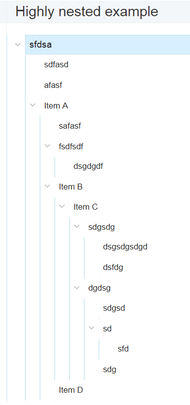
Some way of having the same feature or all hierarchy levels. Sometimes in largely nested lists it can be hard to see which hierarchy level each item corresponds to, especially if you have something like this: https://beta.checkvist.com/p/PPZ9m2xenO3Jf2IGIuX2oK
It can be a bit hard to tell if item D is on the same level as Item A, B, or C.
I can see both of these options interfering with the minimalist design, so if they were able to be options in the CSS, that would be very helpful.
Not sure how difficult these are to implement, but if not too difficult, they would be appreciated.
@jim Thanks, Jim! We plan to improve hoist visibility a bit, but we definitely want to move pin away from the toolbar.
@CobMoo Thanks, glad you like the new indicator. Regarding your points - you’re right, more indicators would add some extra noise, and this is not what we’d want. For largely nested lists, one should probably use hoist, and this is where we could improve the behaviour (as currently, the current node mark is useless because it always shows the top-level focused node). Will try to improve it.
I think it’s a move in the right direction, but it’s not there yet.
Merged toolbar: (1) Confuses me when hoisting because a lot of the functionality behind the icons still works on the list as a whole and not on the part that I see. (2) The icons should be collapsible to the right (like the breadcrumbs are collapsible to the left). I don’t use them that often to see them all the time (and I perceive them at the same level/attention as the title and the breadcrumb).
Side note: Typing right-arrow on the rightmost item in the breadcrumb takes me to the first task. Typing left-arrow on the first task doesn’t take me back.
I liked that Hoist was available easily/effortlessly with one tap on the tablet. Now I have to focus my eye and fingers two times to get the same. (This doesn’t focus me, it distracts me.) The good thing is that it doesn’t scroll off the screen.
The blue “Share” button sticks out too much. When sharing, the Chain/Link-Symbol does the same as the “Share” button. (Visually it looks like a different thing.)
I’m missing the option to “Keep filter & focus.” (Actually, I wish there was a way to store and restore filter & focus any time I want.)
Guiding lines: IntelliJ shows hierarchy in a nice way. (1) Very thin lines guide the eye near the code. (2) A thicker line in the gutter shows focus and hierarchy (it does so using color; it doesn’t change thickness; and it re-colors). Maybe there is something in between your approach and the IntelliJ approach.
You’re right, this is confusing. We’ll probably disable global list actions in the hoist mode, when the actions are not relevant and may have a non-expected outcome. The next task would be changing the actions scope to honour the focus mode.
Not sure about icon collapsing, in which situation you expect them to collapse?
Thanks for noticing, will fix.
Maybe we should detect tablets and offer a more simple way to focus a list item. Will think about it.
We’re going to make it a bit less distracting when the list is already shared. But we really want people to use sharing more actively as it brings us new users.
Sounds like a fresh bug, but I’m not sure how to reproduce it. This option is available both in the public and private sharing, when there is a focus and/or filter.
Will see if we could improve the situation here. Still, Checkvist is not a code editor and vertical guides may have a bit less value than in the source code.
I was in the same boat - I find the bright blue Share button distracting. But, with a little bit of custom CSS, that’s easily remedied. The code below will completely remove the Share button from all lists.


 But maybe you are right about the color. Let’s see.