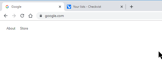
In Win10 we’re now seeing the backwards Checkvist check mark application icon, (i.e. the 16x16px graphic) depicted in blue as opposed to its familiar and distinctive maroon color. This is a problem because basic blue is very common among other application icons and our Checkvist browser tabs are now difficult to spot. I would think that continuity of your brand identity would also be important to you.
Hello!
Thanks for writing us about the problem. Looks like we have to make changes into the favicon to make it better distinguishable.
Could you make a screenshot which would illustrate the problem?
As for continuity of our brand identity - Checkvist was red for more than 10 years, and we’d decided to make it fresher, both on the web site and in the app.
Thanks!

I don’t like it either, which does not happen often with Checkvist design decisions. Worse than the color (blue) is that now the background sticks out instead of the checkmark (white). The old icon was much easier to spot and more pleasing to the eye. At least that’s my perception. Moreover, I don’t like the intense blue as a background. Mail and weather apps may have such a color. Tasks are note blue. It makes me much more feel like looking at an aged design than your old one.
![]()
Some apps let you choose the app icon. I always wondered who would want such a feature. Now I understand.
Hello,
Thanks for the feedback! We loved good old ‘maroon’ too - the first 10 years 
If I understand the comments correctly, only the browser icon is a problem. We can’t fix ‘tasks are not blue’, but the rest is fixable, I hope.
We are going to update both browser and mobile app icons and will strive to make them look nicer 
Yes, it’s only the icon that has to be spotted among dozens of open tabs. Tasks may be blue, but not that blue.  Thanks for taking a look.
Now it’s great as the rest.  Thank you for reconsidering and redesigning.
Hello, Ralf!
Seems like this version has got more fans  Thanks!
But we are still working on it, maybe will add some polish - or some useful function, like showing the ‘due now’ or ‘overdue’ indicators
![]()
![]()
I like subtle indicators. The version I see now has a good contrast, looks clean. The stroke is not too thick.
![]()
Keep tweaking! 
I like the and appreciate the impetus to change and freshen things up but just not that shade of blue - somehow it seems too ‘bright’