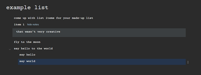
I know that this forum is focused mostly on feature requests, bug reports, etc., but I thought it’d be cool to have a place where users could share their personal CSS customization for Checkvist specifically. Does such a place exist and am I just unaware of it? My version included here differs only slightly from the public samples managed by admins. It’s main additional feature is that it supports a monospace font, with uniform font size and sub-items indented by 3 characters exactly.
.zenBgImage {
background-image: none;
}@import url(‘https://fonts.googleapis.com/css?family=Courier+Prime’);
.list-h1, .userContent {
font-family: ‘Courier Prime’;
}ul.topLevel li.task, ul.topLevel ul li.task {
font-size: 14px; /* Makes all lines the same size /
font-weight: normal; / and weight */
padding-left: 2px
}div.nodeImage {
top: 3px; /* Adjust the collapse/expand triangle */
}.editable, .editableList { line-height: 1; }
div.coreDiv, .editable { padding-top: 1px; padding-bottom: 1px;}.authorPic, ul.comments table.commentTable td.authorPic {
display: none;
}
ul.comments div.coreNote {
margin-left: 0;
}

