Actually, I hadn’t even realized all these years that it goes away on its own. I thought the default behaviour was the manual “Esc” to kick it away.
Today I thought, I might dig into its CSS to try to hack it to make it disappear, and that is when I learnt it actually goes away after a certain timeout!
Indeed, the timeout is way too long.
Thanks for bringing attention to this, never thought this Undo message could be annoying.
What do you think a more appropriate timeout for it would it be?
Do we really need it to begin with when Ctrl-Z and “Restore from History” are already available?
My vote would be to take it out completely or have it as a setting to turn off/on.
A short timeout might lose its meaning with the possibility to click on the Undo and a longer timeout is irritating (as it blocks the view) and also increases number of clicks/keypresses (ESC)
Or, how about keeping the timeout for the notice really short (1 second visibility with a fade out exit) + removing the undo link from the notice and just add text (Press Ctrl-Z to undo)?
This will make sure that the text is visible and the relates short cut (Ctrl-Z) is also taught to those who are unaware. This will reduce the current direction for people to click on the Undo link and also remove the reason to have it stay for long (since the message and the information on how to undo can be quickly read)
Thanks for the idea. So far I’ve reduced the timeout to 7 seconds for most cases, will see if it will be better. Undo message sometimes lengthy, as it indicates what has been done, and including keyboard shortcut for each of it may make it less readable. This fix is on the https://beta.checkvist.com
I have now tested this change, but still feel that it does not take away the need for the extra ESC click to take away the notice in the top-middle of the screen (which I do not find easily ignorable, since it distracts from working on the list).
I am considering to take it away (or reduce its visibility to 1 sec at most) through CSS customization. Do you think that might work?
Custom CSS solution may work, especially for hiding the message completely.
Reducing its visibility to a smaller timeout may be also possible, but is more tricky, because would require using CSS transitions for that. I don’t have a ready-to-use CSS code for that, sorry.
Yes, it is clearly an improvement over earlier implementation. The color tone is subtler (which is good) and also its location doesn’t cover the list items (which is very good!).
Though to be nit-picking and from aesthetic point of view, the current location does feel a bit odd and looks to be a bit asymmetrically placed somewhere in the bottom. Aesthetically the previous one felt logical - being center aligned and at the top (though functionally it wasn’t all that great, as per the earlier discussion).
Isn’t it better to move the message popup completely inside the left-gutter? That will also bring the left-gutter to some active use, as it currently just feels like empty space on the left.
I feel that once it is inside the gutter, I will be less prone to “Esc” it out (and save a keystroke), since it doesn’t obstruct my list’s visibility
Hi @saurabhg9, the matter is you don’t always have the left gutter. You can try resizing window to see how Checkvist behaves and tries to fit the content. Still, we have to show the full undo message in all cases.
Oh, yes. That’s right. I see your point regarding the gutter
Btw, do we really need to show the alert message? In most text editing paradigms, one does not get an alert everytime one edits or deletes content. Shouldn’t the alerts be for something less trivial? (or maybe a configuration option to the user, if they would want such warnings, as not everyone wants verbosity)
Just in case, we’ve deployed more conservative undo messages to beta - I think this is what you were talking about. We’re going to release it on production the next week.
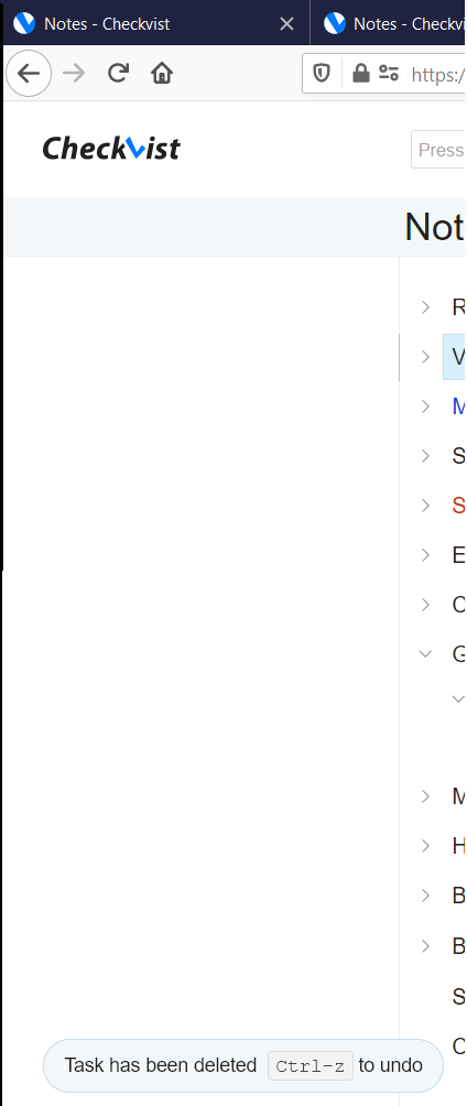
I could not detect any change in the way the message looks or behaves from how it has been before. i.e. I still see it at the bottom left corner of the screen.
The undo message stays for about 18 seconds before disappearing. I thought you had reduced it to 7 seconds? Could this be a regression?
Could you clarify, what specifically has been changed?
My last change was about reducing cases when Undo message is shown. For instance, after a simple edit of a one task, or setting a due for a single task, Undo message is not shown now (but Undo still works).
Now, I’ve also reduced the Undo timeout to 15 seconds.