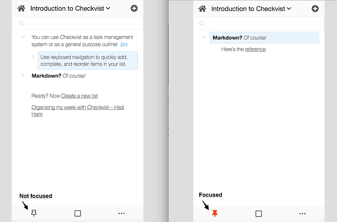
We’ve just fixed an accessibility issue with our mobile web app. Now ‘focus’ and ‘unfocus’ icons are more distinctive than just blackish/reddish.
It’s so hard to see a problem sometimes. Like if you are not color blind. But when you explain it, we’ll try fixing it asap. Write to us ![]()
