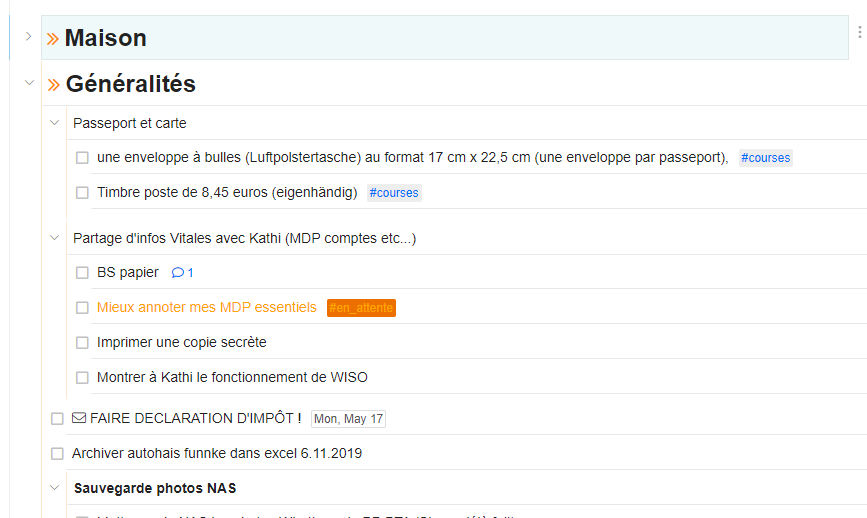
Hello ! I know it could sounds strange to you if you really like the “white page” effect of the Checkvist interface, but I’m wondering if there is a way to add a kind of thin grey line between each task.
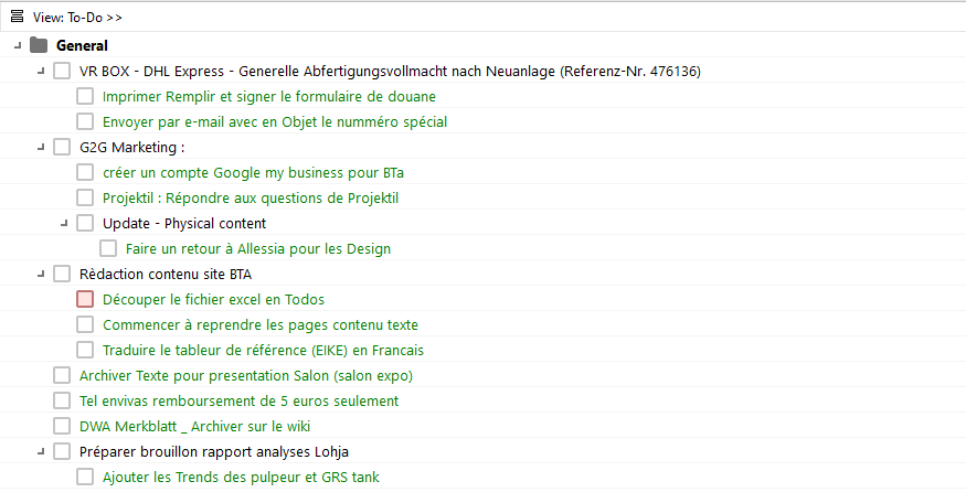
Why Im asking it ? Because I use 2 outliners in parallel : MLO for my first business and Checkvist, for my second business and personal life.
While switching form MLO to Checkvist, I realised it was easier for my eyes to focus on task with this small grey line in MLO.
It is like my eyes doesn’t have that much effort to do to visually separate one tasks from a other.
Attached you find a screenshot of my lists on MLO.
Any Ideas how this could be achieved ? With CSS ?
thanks !
1 Like
Also, I just noticed in checkvist that my task aren’t 100% aligned with the checkboxes on the left (see screenshot).
This may also contribute to this strange sensation I have that “looking at my tasks isn’t that pleasant”. Since there is no physical task separation I guess the position of this checkbox may be even more important.
Hello,
I am happy to share what I have done.
Not exactly what you are looking for but pretty similar.
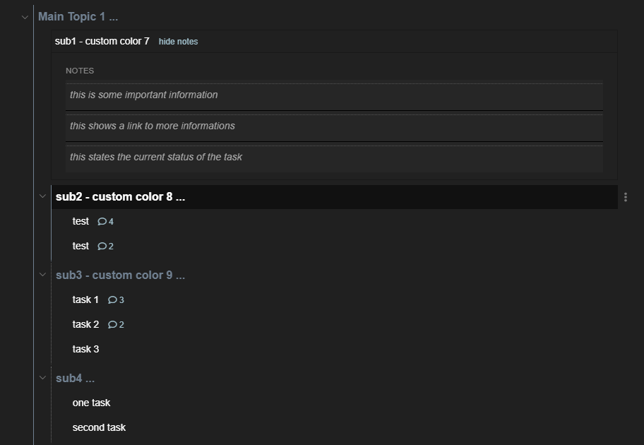
I have a line displayed LEFT of the tasks and for the notes above them.
NOTE: I know very little about CSS and experimented a lot to get this result. It is perhaps rather “botched” but serves its purpose for me.
If you have questions, I’m sure others can help better. 
/* for parents show a boarder on the left*/
.list_tag_outline ul.topLevel li.task.node_expanded {


  /* this is only a trick to seperate the lines between tasks - I wasn't able to do it more elegant - this may not work for you*/
  border-bottom: thick solid #20202000;

  /*THIS IS THE RELEVENT PART FOR YOU  - border on the left could be changed to border-bottom if you like this more */
  border-left: thin dotted DimGray;
}


/* different line for selected*/
.list_tag_outline ul.topLevel li.task.node_expanded.selectedFrame {

  /*line on the left side*/
  border-left: thin solid SlateGray;
}

/* again only a different style for selected*/
.list_tag_outline ul.topLevel li.task.node_expanded.selectedTask {

  /*eine Linie auf der linken Seite*/
  border-left: thin solid SlateGray;
}


/* a line above notes */
.list_tag_outline ul.comments div.coreNote {
  border-top: thin dotted #555555;

}
1 Like
Hello @Thomas_Girard ,
The checkboxes look weird, but they look OK in my account. Which browser do you use and do you have any CSS customization at the moment?
Thanks,
1 Like
@maxkir your are right for the checkboxes : Something is wrong with my CSS, I will investigate it. Without CSS personalization, the Checkboxes are correctly displayed.
thanks @chrisCV ! I will have a look at it 
It would be interesting to see a screenshot of your implementation, if possible.
1 Like
Man, This forum has some real organizational geeks here. MLO? You’re bringing back memories. Oh the nostalgia  Thank you for your post.
1 Like
This is how my customisation looks at the moment…
2 Likes
Nice! I like your Venetian blinds 
Hello Chris,
Thanks a lot for sharing your CSS customizations! Do I understand correctly that you’ve added another vertical separator for a better understanding of the nesting level? I honestly don’t quite remember if we discussed this before …
Best,
Yes I did and I think there was no discussion because I managed to find out how to do it on my own  .
.
The vertical lines on the left give me a better “feeling” which items are on the same level and the selected ones use a brighter color so I quickly see where in the “tree” I am.
It’s not perfect but comes close to what I wanted to achieve.
 nearly identical in style
Great @chrisCV ! Thanks for sharing, the bar on the left is also a really good Idea for better visibility.
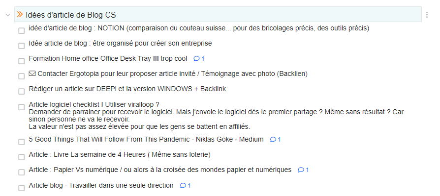
The result on my list ist Great and satisfies me to 95%, ha ha ! (see Screenshot).
->> Would it be possible with CSS to set every single Parent as “Bold”  ?
?
Being able to automatically change this formating could help to visually separate “do-able” tasks, from “project label”.
Any Ideas ?
->> Also, @maxkir , the issue with the checkbox position came from this line of CSS, that I copied from the page “CSS Customization Snippets” 
Reduce inter-line spacing 1
.editable, .editableList { line-height: 1.1;  }
div.coreDiv, .editable { padding-top: 1px; padding-bottom: 1px;}
The Paddins and high of the line could be adjusted, but the Check-box stay at the same position.
1 Like
.list_tag_outline ul.topLevel li.task {
font-weight: bold;
font-size: 16px;
color: SlateGray;
}
Thanks Chris ! Using this, each single task is bold, in my list :-).
I will investigate a little bit more. And Thanks for sharing !
It was late  I forgot to give you this part too …
/* font for the notes*/
    .list_tag_outline ul.comments div.coreNote {
      font-weight: normal;
      font-style: italic;
      font-size: 14px;
      color: darkgrey;
      margin-left: 0;
      border-top: thin dotted #555555;
    }

/* Font for the "leafes" */
.list_tag_outline ul.topLevel  li.task.leafItem {
  font-weight: normal;
  font-size: 14px;
  color: white;
}
One remark: If you find something like “list_tag_outline” in my snippets → this means you have to tag the whole list with #outline to get this formatting.
Thanks Chris, I will test it soon !


 Thank you for your post.
 nearly identical in style